") Artsmiths of Pittsburgh
Artsmiths of Pittsburgh") Hoyt Center for the Arts, New Castle, PA
Hoyt Center for the Arts, New Castle, PA") Portage Hill Gallery, Westfield, NY
Portage Hill Gallery, Westfield, NY") _Open Houses in my Studio
_Open Houses in my Studio _Or…contact me about hosting a private party!
Another creative yet meaningful thing I did in 2020, one that just happened to end up taking place during the pandemic shut-downs, was to volunteer to make three squares for the Violet Protest project. Personally, I am not happy with the way “politics” is handled by “social media” (and by others, but all that is for yet another discussion) so I don’t tend to say much about political topics online. (I am not apolitical! It’s more that only occasionally do I wear politics on my social-media sleeve.) But this seemed like an idea that people from either / any side could support, which is why it interested me. Because I do believe that we have to stop talking at each other and re-learn how to converse with each other, to stop emphasizing our differences and start making progress for the future via the interests and goals we do share…
So what is the Violet Protest?
In short, makers from across all 50 states, the District of Columbia, Puerto Rico and all American territories—without regard to their own political inclinations—are joining together in using their time and talents to make 8” x 8” fiber and/or fabric squares using equal parts red and blue. These are, first, being exhibited in Phoenix, AZ; after about six months, the show will be taken down and the squares will be distributed to all members of Congress, of all parties, to ask them to find ways to come together too.
“Focused on the values we hold dear as Americans, rather than any political beliefs, the color violet symbolizes the literal combination of red and blue, long held as symbols of our nation’s differing ideologies. Our common goal is to send a physical message of friendly protest through this … visual expression to demonstrate that if we as citizens are willing to come together, so then must our elected officials.”
For more detailed information, you can check the project’s website, at violetprotest.com
Why did I decide to make three squares?
Some people volunteered to make just one; others, scores! The website is set up for you to easily choose to make one, or else multiples of five, but it was possible to assign yourself a different number of contributions. I offered three.
Since the idea is that, at the end of the museum exhibit in Phoenix, the squares will be packaged up in groups and sent to each of the current members of Congress, I figured that, even though the pieces given to each recipient would be assigned at random, the fact that there were three people supposedly designated to carry my voice to congress (one regional state representative and two state senators) meant that three would be a good number to make.
(Also, I made that commitment early in pandemic, when some supplies were scarce and lots of stores were closed to the public. I did have a few small skeins in appropriate red and blue colors (among several I had “inherited” when the mother of some friends died a few years ago). I knew those skeins would provide enough to make three squares, but I really wasn’t sure if I could squeeze any more out of that stash!)
What Is Hairpin Lace?!
Before I explain the why of my design choices, let me show you a little bit of the construction process.
The technique I used is called hairpin lace because, in the past, delicate, lacy designs were made by looping and then crocheting very small, fine threads on actual hairpins! While I do dabble in a bit of miniature artistry at times — various kinds of clay, both ceramic and metal, being my favorites — I am not into working on mini fiber projects (though I have seen some made by others that have been truly stunning!)
404_0199_HairpinLaceScarves_andOneHat.jpg)
I’ve used a larger-scale hairpin lace process to make, for myself and as gifts, a number of winter scarves and hats, and even one large blanket (with a second one that’s turned into a perpetual UFO…). Most often, I will choose three complementary colors, or three different shades of a hue, and work with them in various pairs. So I’ll use a big crochet hook and two strands of yarn at a time for each “row.” I will make each one just a little bit longer than my final goal (because I find it easier to pull out a little bit if it seems to be shaping up to be longer than planned than it is to add a little more at the end. The latter is possible, just not as much fun!) Then the individual strips are hooked together to create the final piece. Picking up an equal number of loops from the strip on each side will yield a flat piece, while differing counts will produce curves. (And for more advanced designs than I’m showing here, you can also vary the width and counts within and across strips.)

What the process photo shows is this: five complete rows already woven together, and a sixth complete strip that’s ready to be taken off its hairpin-substitute “loom” and added to those.
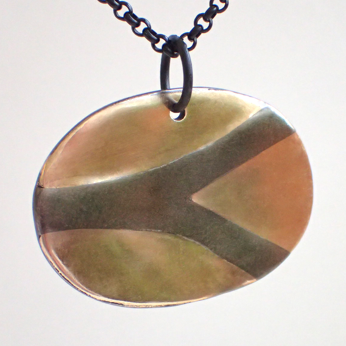
The weaving together is what will tweak the size, both length and width, of the final piece. Not a problem with a scarf where exact sizing is unlikely to matter, but trickier when your goal is to end up with a square that is exactly 8 by 8 inches! The photo shows Melting Pot where I did hit it exactly at the 8-inch width but, yikes!, this first of my squares ended up being only 7 inches long.
I set it aside to make the other two. Lessons learned, I got those to come out to just the right size from the start. In the meantime, continued forced closures of public gathering spaces meant the the exhibition dates for the Violet Protest show were pushed ahead by a few months. Instead of opening just before Election Day in 2020, the museum show would launch soon after Inauguration Day in 2021. I had plenty of time to fix up the size of my third piece and, when complete, I sent them all in!
My Thinking with These Three Designs
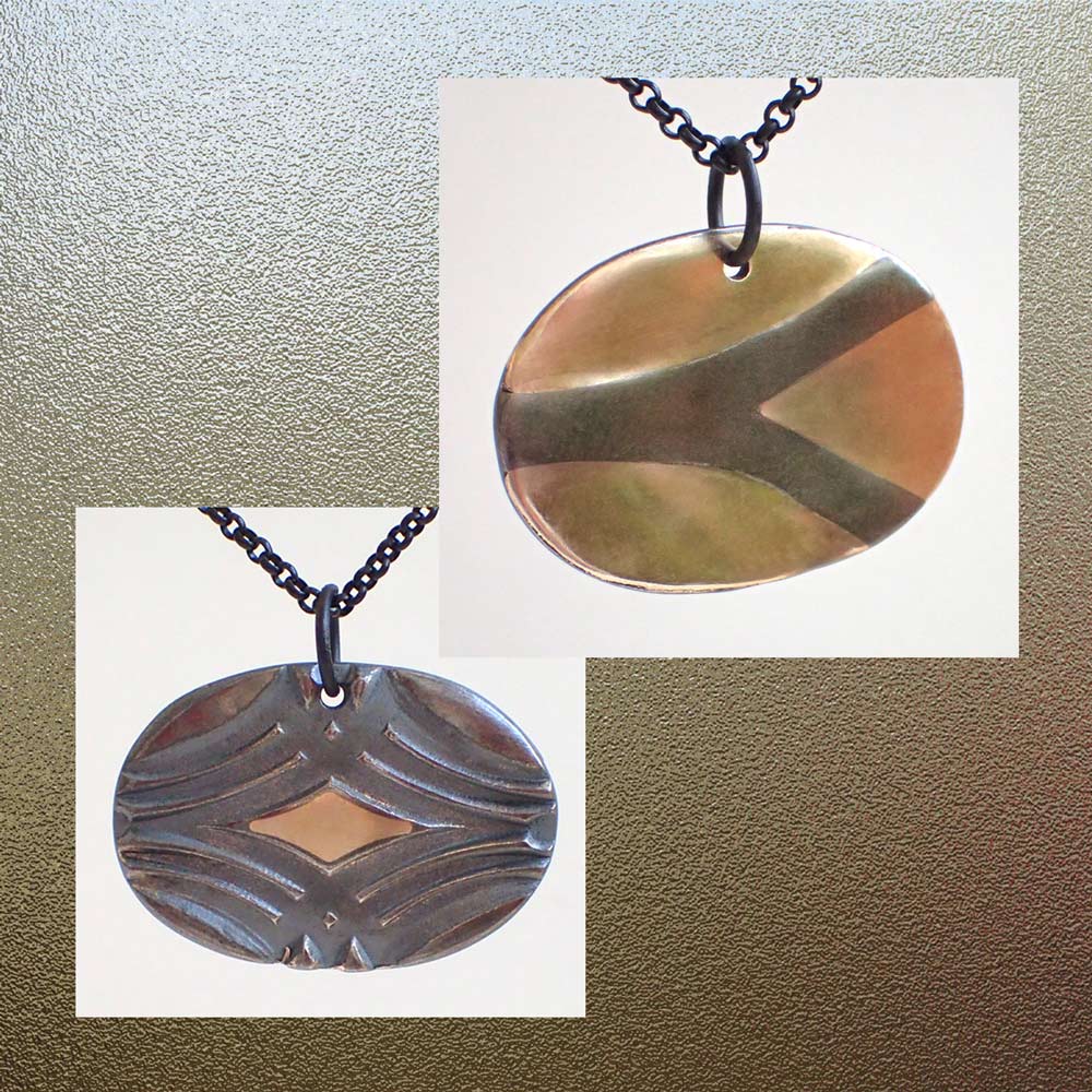
But why the three designs I chose? Now that you have at least a little idea of how the rows are made, and how they interact, let’s take a look at my three offerings, from left to right, and I’ll describe the symbolism I feel in each one:

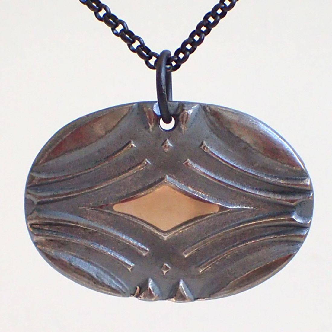
Top, left: How can anyone imagine simply staying in their own red or blue lane (even if they try to do so with civility and respect) when ALL OUR LANES ARE CONNECTED?
Center, bottom: Rather than divide by red vs blue, why not combine creativity, courage, compassion, and compromise as we all aim our efforts to be for THE COMMON GOOD?
Top, right: Can politicians from across our country model, not selfishness and division, but consideration, collaboration and compromise … for all people but especially for the children of our great MELTING POT?
Would you like to join the Violet Protest?
As I write this, you still can! A few photos from the exhibition can be seen online at https://www.violetprotest.com/vp-at-phoenix-art-museum.html. It has been open for in-person viewing at the Phoenix Art Museum since March 10, and will remain open though September 5, 2021. Squares can still be registered (in advance, to get the required exhibition tag!) and sent in. Submissions will be accepted and added to the display through August 1.
- To volunteer to contribute one or more squares:
https://www.violetprotest.com/volunteer.html - To offer a donation to help offset the cost of mailing squares to Congress:
https://www.violetprotest.com/donate.html
After the show ends, all the squares will be evenly (and randomly) divided up, packaged, and sent to every member of Congress. I sure hope that some of them get the message!
Do you think any / many of them will?!! Please leave a comment!
(Well, that is, please leave a comment that (even if it is controversial) shows respect, kindness, compassion, candor, and, perhaps, also creativity; any that do the opposite will be removed.)