") Artsmiths of Pittsburgh
Artsmiths of Pittsburgh") Hoyt Center for the Arts, New Castle, PA
Hoyt Center for the Arts, New Castle, PA") Portage Hill Gallery, Westfield, NY
Portage Hill Gallery, Westfield, NY") _Open Houses in my Studio
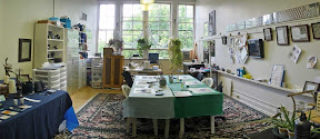
_Open Houses in my Studio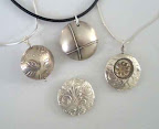 _Or…contact me about hosting a private party!
 After designing a piece, working with metal clay to create it, and firing it in the kiln, there remains another step to consider: post-fire color of the now-all-metal creation. There are lots of ways to add color to a piece, and I’m not about to go into all of them now. That is, for this post at least, I am not going to address deliberate colorings like enamel, resin, colored pencils, inks, various forms of plating, and so on. I am going to make a few points about several of my newer bronze pieces and will mention only in passing the “Liver of Sulphur” (LOS) patinas that can produce such nice (but somewhat unpredictable) colors on fine silver (and black or near-black on silver, copper, etc.)
Instead, what I’m thinking about today are the kiln-produced colors that sometimes appear on bronze pieces (and, to a lesser extent, on copper ones). Now, the thing is, they are basically unpredictable. You get what the kiln-gods decide to give you that day.
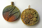
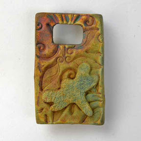
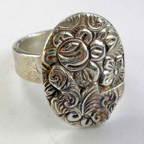
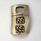
If the pieces come out a dark gray or black color, I will usually just polish that off. I wrote a series of posts in April of last year with “before, during, and after” photos using Hadar’s Clay Powders, and one of those showed pieces with a lot of this mostly-icky black coating that is best just polished off. That is why the first photo with this post (above, right), of a rectangular bronze piece, shows it all shiny: that side came out of the kiln all dreary gray except for one small, dreary, brown spot on its edge. (It was so dreary, in fact, that I didn’t even think to take a photo of it in that state.) But you’d never know that now from looking at its bright, polished surface if I hadn’t told you, would you?
 Then again, sometimes pieces come out of the kiln with stunning colors. The second photo (left) shows two other pieces that came out of that same load. (As ever, a click should get you a bigger version of any of these.) When people see pieces with colors like that, they always respond with all sorts of exclamations of “Ooooh” and “Ahhhh”!
Which I fully understand. Except I know that those colors are basically ephemeral: there for your enjoyment at the moment, but nothing that will remain so brilliant for very long.
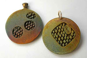
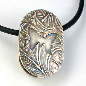
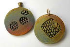
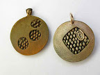 If I make a comment to that effect to the piece’s admirer, novices are often generous with suggestions. And I do appreciate the offers. While I am open to new ideas (especially since many of my students are artists with experience in other media), there’s also a good chance that I’ve already tried everything that’s being suggested, and then some…. The third photo with this post (over to the right again) shows two of the many things that one might consider trying.
Of the two pieces shown there, the one on the left has been lacquered. Notice how the nice, variable, kiln-green has all gone a sort of even brown shade, and the lovely bright scarlet has turned a much duller orange. I don’t dislike those colors; they simply are not the ones I was trying to preserve. In fact, I only rarely use lacquer on my pieces. It does provide some protection in the short term but, once it starts to wear off, then you have a piece that darkens in those spots but not in the ones where it remains. I do keep trying various kinds of coatings, here and there, just to see what happens, but they are not a major part of my routine. (Similar shifts and dulling of bright colors happen to LOS’d silver that emerges all brilliant and lovely.)
More often, I will do what’s shown on the piece to the right in that photo. That is, instead of the “high polish” of the rectangular piece, I will give it a “light polish” like this, often highlighting one or more select areas with a slightly brighter shine. I chose to include here a piece where I’d done that so I’d have an example I could show folks, later, who seem very surprised when I say that another reason the original colors are ephemeral is that, if they are deliberately polished or rubbed enough in normal wear, the colors will go away. Except that’s exactly what polishing does: the color is only on the surface and polishing that removes whatever reaction has happened there while also laying down the metal “crystals” so they reflect light in their “typical” color range. (Again, this can be compared to what happens with silver, both in the disappearance of the “kiln white” (or, in some cases, “kiln glitter”) and the dulling and/or shifting of colors from LOS or other patinas.)
Except, the crazy thing is, just like everything else involving these colors, you can’t quite count on all the things I described above. Some, yes, but not everything. Shown below are two shots of the “other side” of the rectangular piece with which I opened this post. This side came out of the kiln with lovely colors. I considered polishing the dragonfly, but decided to leave it alone at least for the short term, and grab a photo of how it looked with no post-fire treatment. Later, when I got the lacquer out to use in coating the round piece, above, I decided to hit this piece with it as well. And, here, the color shift was much less dramatic!
 |
 |
| straight from the kiln | after being lacquered |
I’m not complaining: I liked the colors here and I’m glad they didn’t shift. I’m just saying, if you happen to get this the first time you try a protectant product, don’t assume that’s what you’ll get the next time.
And I also recommend learning to appreciate and celebrate ephemeral beauty, in jewelry and otherwise.