The simple answer to, “What did you do last week?” would be, “I made up a handful of textured, domed disks to play with.”
In the rest of this post, I’ll discuss (with illustrations) just what I did. In my next post, I’ll explain why I did that. I hope to add another post, eventually, where I’ll review a few little tweaks I just happened to add to the plan…
I didn’t think to stop and take photos of the earlier stages in the construction of these pieces. Mostly, it was just the usual routine for working with metal clay. I began by mixing up small batches of several of Hadar’s metal clay powders that I wanted to use. The clay was then rolled out, textured (in general, on both sides), cut, shaped, dried, drilled, and in just a few cases, further “refined” (e.g., a few pieces had their edges sanded down just enough so the final result would be even and smooth) before going into the firing pans.
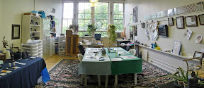
At this point, I started taking photos. (I have found myself tending to take a quick snapshot of each shelf or pan as it goes into the kiln. That way, if anything seems odd afterwards, I’ll have a record of what was where. Though, my usual load involves one-of-a-kind work; with so many similar pieces in this load, that isn’t going to tell me very much, is it? Oh, well.)
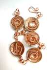
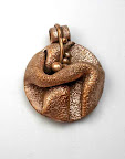
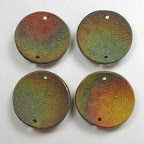
This photo shows the thirteen pieces I made. Ten are basic domes. The other three (to be discussed later) are the ones with little wire loops attached to them. (Click on photo to enlarge it, if necessary, to really see any such details….)
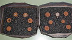
The pan to the left contains pieces made mostly using quick-fire copper clay; to the right, mostly using rose bronze metal clay. (One or two of each also contain some pearl gray steel, but those are the ones I’m going to hold off discussing for a while yet.)
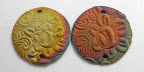
The next photo shows two of the copper domes, just as they came out of the kiln. Note the lovely color on the one to the right (convex side up). That was a surprise! (And it’s what prompted me to start my tale here, with the disks themselves, rather than just with how I used them.) I am not used to seeing much color variation on fired copper, at least not seeing it as vividly as I often see with the bronzes. My fired copper usually just looks dark, like the one on the left. Several (though not all) of the copper pieces showed delightful color this time. And the brightest colors all appeared on the convex sides, the side that I had placed face-down during the firing.
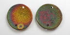
This next photo shows two other copper pieces, less colorful from the kiln, and therefore all polished up to a reasonably bright shine:
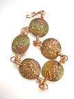
Here are four rose bronze domes, straight from the kiln. Again, these all show the side I’d fired face-down. In the past, when the bronze pieces came out with colors, it has seemed that the nicest ones seem to appear on the side positioned that way. (Though you can’t count on seeing that at all: you just have to be thankful when you do!)
Then again, this time I noticed some pretty interesting colors on the sides that were face-up as well! The pieces shown in this next photo are just the same four, from above, turned over.
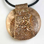
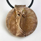
A side note: All thirteen pieces had the same “rose” texture on their convex side. The other side, however, got a slightly different treatment, depending on which metal I was using. I wasn’t sure how much I might care to know which was which as I was later working with them, but that seemed a simple yet unobtrusive way to distinguish the different metals if I wanted to quickly tell them apart.
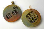
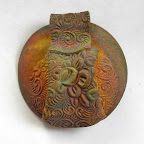
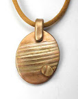
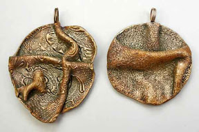
Here are a couple more rose bronze disks. On the piece to the left, note the little red dot just to the left of the hole at the bottom.
Now, I admit, I didn’t note anything particularly memorable about that dot, itself, until I turned the piece over. Hmmmm. I wonder what tiny bit of something got into my carbon, to create the little, tan “washer” image on this side? You should be able to see it clearly at the bottom of the piece here on the left, just to the right of the hole. Its center matches the position of the red dot.
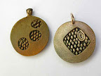
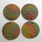
Well, I’ll never know the answer to the question of what caused that. But, here, you can see all ten disks after I finished polishing them up by varying amounts:
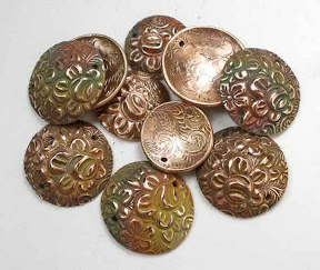
Knowing that the kiln-induced patina-colors are rather ephemeral, that they’ll wear off the high points, at least, as the piece is touched, worn, jostled in a jewelry box, etc., I decided to polish that off all the high points on the convex sides, while still leaving some down in the hollows. (I did give a full polish to a few select pieces that did not show much range in color.) Then I fully polished the concave sides—for several reasons, the decision to go for a full shine there was somewhat beyond my control. Partly, it had to do with how I intend to use these (see my next post). Also, it was due to the polishing tools I have that made it easy for me to limit what I’d polish on the “outside” to just the high points, but that meant I pretty much had to do a full-scale polish down in the “inside” anyway (or else, spend a lot more time on these than I thought they warranted). That was fine. I am happy with the results so far.
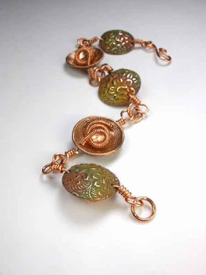
Please stay tuned to see what I’ve begun doing with these….

") Artsmiths of Pittsburgh
Artsmiths of Pittsburgh") Hoyt Center for the Arts, New Castle, PA
Hoyt Center for the Arts, New Castle, PA") Portage Hill Gallery, Westfield, NY
Portage Hill Gallery, Westfield, NY") _Open Houses in my Studio
_Open Houses in my Studio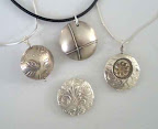 _Or…contact me about hosting a private party!
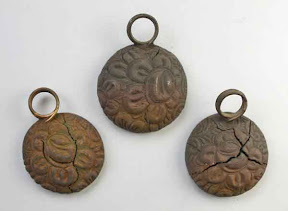
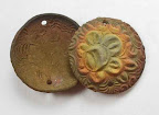
 The two draped pieces actually polished up nicely. Somehow that even helped with the clunky sound they were making, that had made me even more dubious about their quality. The more-irregular one, of course, is still riddled with cracks and tiny holes: it will just look prettier in my “do as I say, not as I do” box of “teaching moments.” But none of the polishing added to the disintegration of that piece, nor did it reveal any holes in the rounder one. OK, so far.
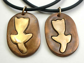 I have not yet tried to polish the tulip with a copper flower on a bronze background because I know that one will take a good bit of work. The other two tulips turned out OK, but not as nice as I’d’ve liked. The bronze (flower) on the one to the left had actually bubbled a tiny bit and, although that did look OK after some grinding, sanding, and polishing, once I exposed it to the patina solution, small spots appeared where the edge of the blisters had been. I’m thinking that the tin in the bronze must have somehow “disappeared” at those points, leaving more copper to react with the patina chemicals. And, despite a lot of grinding on the other one, I did not seem to have eliminated all signs of the earlier cracking.