Lately it seems that all I’ve managed to post about are shows, not the creative process. I do love shows, parties, festivals, and more. I want people to see my creations, those are great ways to enable that, and talking about those is generally considered to be a way to help in finding an audience for my works.
But I also enjoy sharing information about the processes involved in my artwork so I’m going to try to slip in one of those posts today. I’ll discuss a technique I use at times that I only just realized I haven’t written about here: using a little electronic die-cutting machine on my metal clays.
As far as I know, Wanaree Tanner is the one who got the ball rolling on using these with metal clays, traveling around doing workshops and promoting the use of the Silhouette Cameo several years ago. It seemed to me that the thing she promoted most was using them to create your own elaborate bezels for setting stones. She doesn’t seem to be making such a big deal about the Silhouettes any more (though anyone who follows her work can see where she’s still using hers).
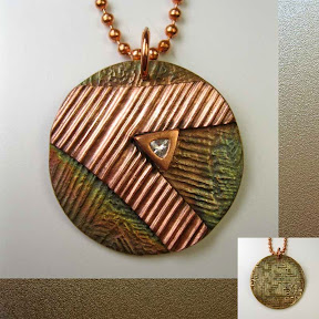
I can appreciate the way she simplifies the making of such bezels with that tool; it’s just not a style I want to emulate all that much myself. Cindy Pope seems to be the person now leading the charge with Silhouettes and metal clays, making layered designs, etching words and patterns along various shapes, and doing all sort of things I find much more up my alley, design-wise. (Cindy was also a great house-mate in CA and then host in OR the last time I went out to the west coast!) The photos with this post will illustrate one of the very simplest applications of these cutters.
Several years ago, I bought a Silhouette Cameo. I used it a few times with metal clays, enjoyed the results, but still found my own designs mostly going in other directions. But I do use that device at home for all sorts of useful little paper-crafting tasks which is really what that machine was designed for.
Of course, not long after I bought my Cameo, Silhouette America came out with a new machine, called a Portrait (more compact than the Cameo), and then a newer version of the Cameo (with a touch screen instead of the buttons that both the Portrait and my older Cameo have)! I guess those are why the one I got was available at a really good price at that moment in time! But that’s fine, because they all use the same software, and attachments, and so on.
 The biggest difference is that the Cameo will cut up to a 12″ width, while the Portrait only goes to 8″ across. Your big scrapbooking papers, wide vinyl, etc., are going to be 12″ across, so the Cameo is best if that’s the sort of thing you’re ever going to do. Metal clay folks work with small bits of clay, however, ones that are typically just one or at most just a few inches across, so the Portrait is more than enough if you’re never going to work on big projects. At one point (after several months of really good sales at my end … and another really good-price offer at Silhouette’s), I bought a Portrait. I figured that having two could be useful: it would allow me to have one each at home and in studio and, even better, it’d give me more options when I finally get around to trying to teach a workshop on using the tools. (Whatever I’m doing, I’m still always thinking about teaching it to others!)
My Portrait now sits on the table next to the computer in my studio. I’m still not into making Sili-cuts as my primary design tool but, now and then, such as times when I’m feeling a bit of a creative block with other methods, I’ll sit down at computer, sketch out a few simple designs, and use those to cut out a few pieces. Just making something, getting a feel of accomplishment, will usually get me out of feeling stuck again. (And that’s probably why I don’t post much about those creations — they feel more like little “interim activities” to me and, once I’m over whatever stuck-ness I was feeling, I’m not particularly inclined to write about them … much as I do enjoy the process (in limited amounts) and appreciate the opportunities they provide.)
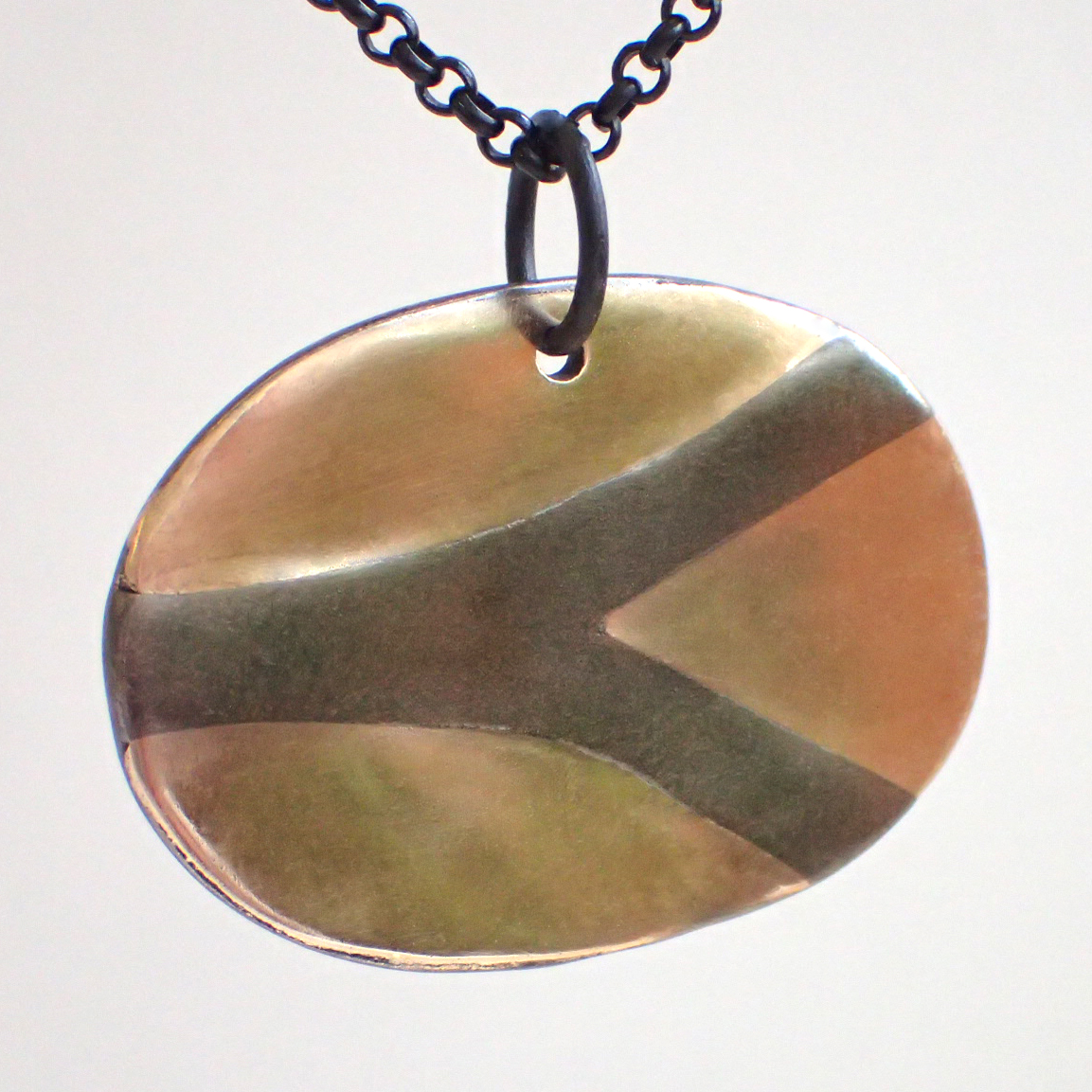
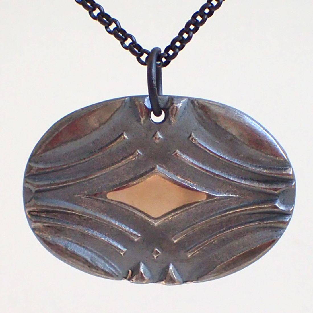
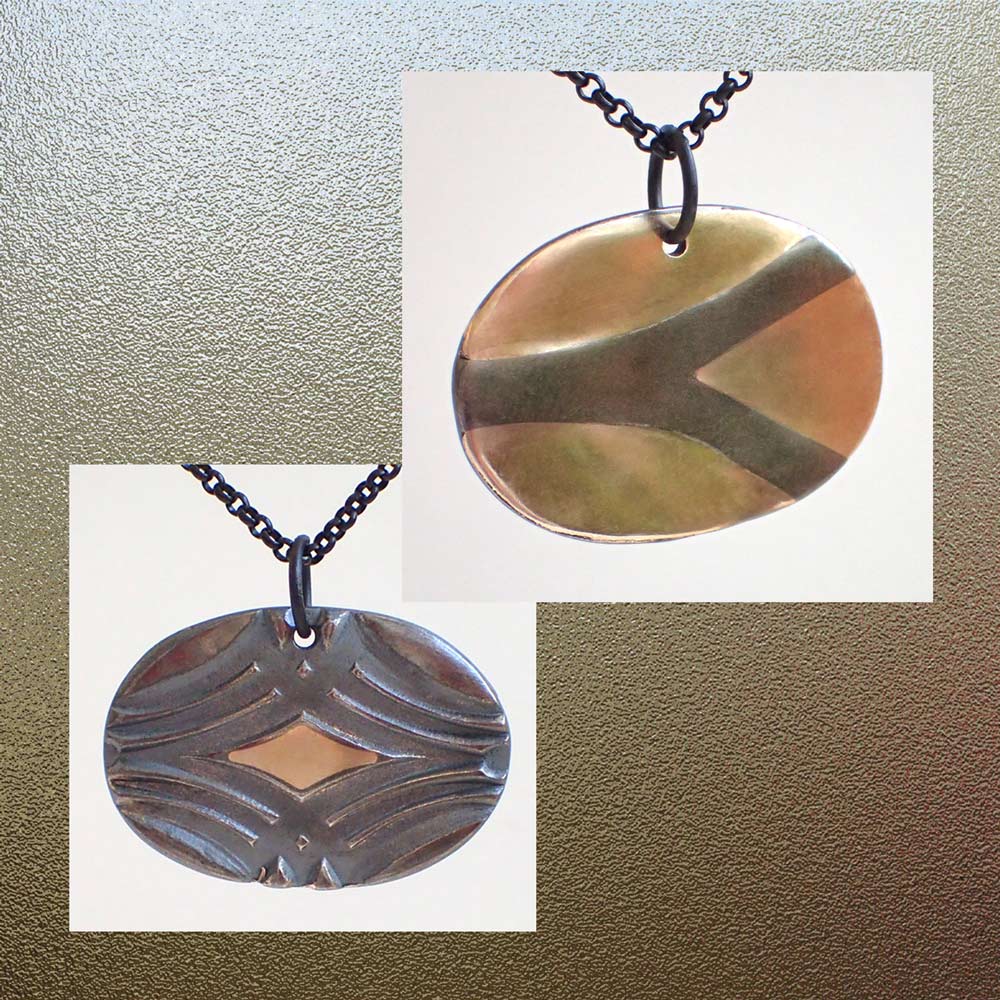
So there I was one day a few weeks ago, with a brand new tube of “One Fire Brilliant Bronze” clay powder. This was the only one of Hadar’s basic “One Fire” clays I’d not yet tried. I wasn’t feeling stuck or anything, I was just looking for something simple to make to try out this new-to-me clay. I had fought a bit with the older Quick Fire Brilliant Bronze: I did like the bright golden color; my problem was that I kept facing challenges with the “bottom side” of textured, reversible pieces I’d made with it. (And regular readers of this blog will know that textured, reversible pieces make up the majority of my creations!) The thing is, with pieces cut on the Silhouettes, you really want one side of the piece to be flat: that helps it to stick better to the cutting mat! So, I thought, if I’m ever going to try this One Fire Brilliant Bronze, using it for plain-backed Sili-cut pieces seems to be the way to go.
So, I mixed up a batch, took a part of that and added a bit of glycerin (which gives the dried clay a tiny bit of flexibility, which is extremely useful as you’re separating your just-cut pieces from the cutting mat!). Then I rolled out a few small pieces with light- to moderate-depth textures on one side only, and set those aside to dry while I sketched a few sample designs. Not imagining I’d have any reason to write about it, I didn’t stop to take any photos. I loaded the clay pieces onto the cutting mat of my Portrait, and cut away. The cutting was the easy part!
As always with a new-to-me clay, I did NOT fill up the kiln for my first firing. I started small, taking just one pendant and two smaller, matching pieces (an earring-pair) and fired those. Massive fail: bubbles and cracks: overfired by a lot! I took another earring pair, dropped the temperature, and tried again. Overfired again but, OK, not quite as much. Another pair, dropped the temp a good bit more, tried yet again. Still a bit bubbly, meaning they were still overfired. To drop any lower, though, I’d be going well below the recommended temperature for that clay, so I went online and asked Hadar herself for some advice. She said the firing range for that clay was actually rather large, she often fired at a temperature close to where I had ended up. Since I know my kiln does actually fire a bit hotter than where I’ve set it, it only took me two more tries before I got things to work out the way I wanted!
 But, while waiting for Hadar to reply, I fell into one of those pits where I couldn’t think of anything else to create. So …. I mixed up some .960 clay, and rolled out a number of small, thin sheets of that with textures on just one side.
Aside: My .960 was made by mixing .999 PMC Flex, which serves the same purpose as the glycerin, and .925 PMC Sterling, which gives more strength to the thin pieces that are at the limit in terms of thickness hat the Silhouette Cameo and Portrait machines can cut. I used .960 instead of straight .925 because its firing is as reliable as the super-easy .999 fine silvers…
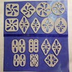
To keep things simple (since I was just trying to perk myself up during a brief lull!), I used the same sketches as I had for the bronze, cut out nine (9) silver pendants and six (6) pairs of earrings (shown in the first photo in this post), cleaned them up a little bit as needed, and fired them right away.
When I finally got a Brilliant Bronze piece to fire successfully, I took a photo of it.
I then fired all the remaining Brilliant Bronze pieces I had waiting and, when those came out fine too, I polished everything up and took a photo. Well, this isn’t quite everything: it’s just pendants (not any of the earrings) and only the ones for which I had enough chain! I’ll have to get some more for that, and finish off the rest. But I am feeling a great sense of accomplishment!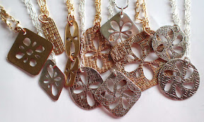
A few final notes:
- Hadar also now has a number of “One Fire Flex” clays (not every color in her range, but many of them). The were designed specifically to be used with electronic die-cutters, like the Silhouettes and other machines on the market. I have purchased a bit of that, but have yet to try any. Since the winter of 2007-08, I’ve been adding glycerin to clays (in varying amounts, and to different clay formulas, depending on the amount of “flex” I want in my dried clay, anywhere from just enough to peel away a cutting mat without breaking to wiggly-enough to tie a knot!) and, while it can be nice to get a little flex without having to do that, it’s now so second-nature to me the need to switch is just not urgent…
- Silhouette America had at least one model before the Cameo, which I think was called an SD (for Silhouette Design, I would think), and they’re about to come out with yet another newer one, the curio (yes, they use lower case for it). The bed of curio will be even smaller than the Portrait, but it will be able to cut thicker materials, meaning thicker layers (less fragile after firing) of metal clay! (Though the Silhouettes are all at the low end of cutting-force compared to other electronic die-cutters, so the curio will still be limited by that with regard to some other materials.) Still, though I’d love to have that option, I need to sell a lot more pieces before I spring for yet another machine… I don’t see the curio replacing my Cameo but, if I were just starting out now, I’d get it instead of the Portrait. Still, having all three could be useful for workshops next year…?!
- I’ve fired a few more loads in the two weeks since the adventures reported above and, at the same temperature (even just a tad lower with the last, very-full load); all have turned out fine! I’ve heard / read about some people who say they don’t like Hadar’s clays because they seem so fussy. My personal experience is that each new one does seem to have its own personality, what it’s like to work with and to fire, but once you find its sweet spot, it’s then at least as reliable as any of the others on the market. Regardless of whose clay I’m using, the scientist / engineer in me is fine with starting off slow, observing what happens, building my understanding, and then taking off! The next time I go on a real Sili-binge, with much more elaborate constructions, I’ll try to remember to illustrate those here too, eventually. It really is a fun little tool!


") Artsmiths of Pittsburgh
Artsmiths of Pittsburgh") Hoyt Center for the Arts, New Castle, PA
Hoyt Center for the Arts, New Castle, PA") Portage Hill Gallery, Westfield, NY
Portage Hill Gallery, Westfield, NY") _Open Houses in my Studio
_Open Houses in my Studio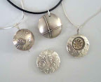 _Or…contact me about hosting a private party!